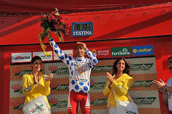
There are four jerseys in the Vuelta a España. Here’s a quick summary…

Red jersey
The red jersey is the leader’s jersey. Once gold in colour, in 2010 it became red. In years past it has been orange, white and yellow too. It is worn by the leading rider on the overall classification, meaning the rider who has taken the shortest time to complete each stage in the race. It’s sponsored by Ahorra Energia (“Save Energy”), a government agency.
Polka dot
This is for the best climber in the race and it’s like the Tour de France… only with blue dots. It is sponsored by Renfe or Red Nacional de Ferrocarriles Españoles, the Spanish national railway.
Green jersey
The points jersey. Riders win points at the finish line and intermediate sprints and the points are tilted in favour of the sprint finishes. It’s sponsored by España Recicla (“Spain Recycles”), a government agency.
White jersey
The “all rounder” jersey, sometimes called the combination. It is based on the combination of the overall, the mountain points and green jersey points whereby a rider’s position in each competition is added and the lowest standing wins, eg 4th on overall, 9th on the mountains and 2nd in the points equals 15 combination points. Remember the lowest tally determines the leader. The sponsor is Fertiberia, a Spanish brand of agricultural fertilisers.


The leader’s jersey isn’t full zip??
The best so far was the blue one with yellow fish pattern. Absolutely adorable 🙂 for the best fisherman in the peloton. AFAIK it was point classification jersey. http://www.cyclingnews.com/photos/2004/vuelta04/stage16/16.jpg
No cheetah print for the leader this year?
Is there a young riders classification at all?
I often wonder if the Vuelta isn’t going to struggle long-term unless it works on it’s image.
Tour – Yellow. Giro – Pink. Vuelta – Gol..Re…bl…errr
Tour – Polkadot. Giro – Green. Vuelta – huh?
Q: Who’s the dude in the rainbow bands?
Exactly. You know what that means without a second thought. If you see this picture in 30 years, what will you think?
http://www.cyclingnews.com/news/photos/evans-back-in-pink-eight-years-later/119886
To me, the Vuelta’s constant rebranding shows a real lack of strength in the brand identity.
Not that it doesn’t also suffer from where it is in the UCI calendar, too. Half the field turn up for a week or two to get sharp for the World Champs then pootle off home.
It’s true that the Vuelta should have more consistency in its brand-making. The calendar change didn’t seem the best idea. The “jersey-policy” looks too ASO-influenced. The leader’s jersey should be orange, like it was in the first edition, because history is this sport’s and a race’s main asset. On the other hand, the race has somehow become more interesting after the Puerto operation. Still, they should make every effort to be imaginative with the parcours: la Bola del Mundo was great last year. The cyclable Teide volcano on Tenerife island, a ride from 0 to 3.718 meters above the sea level, has been waiting for too long.
i remember reading in a book i have how both the giro & vuelta were used by the respective governments to “unify” the country and/or use as a “distraction” for the masses when things weren’t going well politically.
it just seems interesting to me that the spanish government agencies sponsor most of those jerseys.
not sure what it means, but there you go.
The colour Orange is too closely associated with the Basque region for it to be used on a national tour of Spain. The national colours of the country are red and yellow with blue as the secondary colour. Yellow is already taken and when they tried gold it looks like a turgid brown/tan on tv (as demonstrated by the awful ToC jersey)
Besides, the podium girls look great in red dresses
I fully agree completely
Tremendous piece of writing..
What a truly great piece.