

A quick note on stage profiles. We all rely on cross-section graphics used to depict the route elevation of a race, this blog’s daily race previews use them as the prime graphic because they’re a graphical heuristic for the day to come, at a glance you can tell a sprint stage from a GC day. Study it for a moment and it says even more but sometimes races can hide information about the route, deliberately or not.
While people have known routes across the mountains for millennia, map-making is a relatively new concept. Early maps would illustrate mountains with cartoonish peaks which gradually became more detailed sketches to show the relief. It’s only in the last two centuries that topographical maps have appeared, and with them the use of contours which in turn allowed profiles to be made.
Profil du Mont Ventoux paru dans L’Auto en 1903. pic.twitter.com/6ENv0v6aEu
— David Guénel (@davidguenel) August 21, 2018
The earliest bike races had stage profiles right from the start but like today they only tell you so much. In 1910 Alphonse Steinès was dispatched from Paris to visit the Tourmalet to see if the Tour de France could go over and this was as much to inspect the condition of the road as well as the mountain. Steinès had a bad time and needed rescuing, but that was his fault for visiting in January and the Tour went over in the following summer.
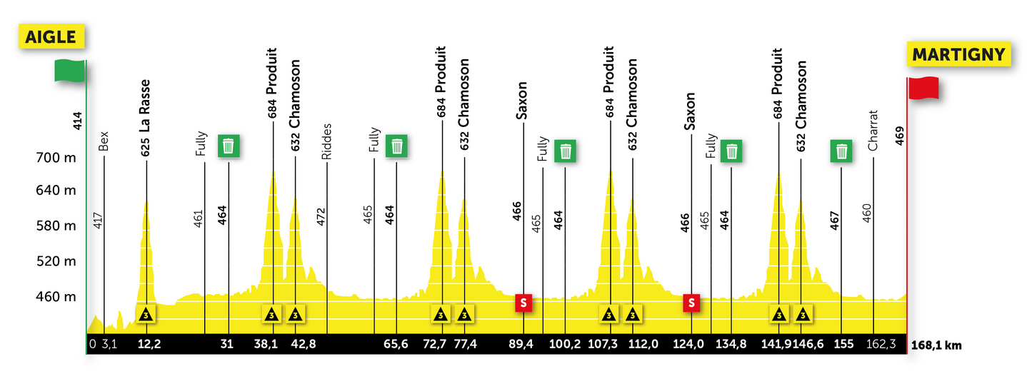
Different races have different designs, they’re almost branding as you can often tell where the race is from according to the graphic design. The recent Tour de Romandie had some y-axis doping with stage profiles that looked more like busy seismographs than profiles, the severity of the spikes didn’t really tell us what was to come.
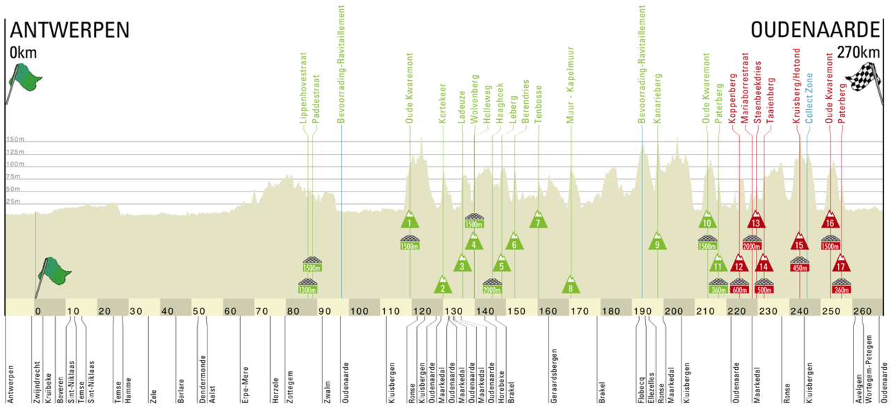
The Tour of Flanders has very little altitude but the y-axis is stretched so much that the hellingen are visible on any profile as they’re so strategically important, here it makes sense to exaggerate the y-axis. The Giro d’Italia’s ones are instantly recognisable thanks to the pink line. Look closely and you’ll see the initials SDS, for Stefano di Santo who does all the profiles for RCS.

That’s the profile for the Giro d’Italia’s Stage 16 via the Fedaia, Pordoi and Giau reduced to scale, a 1:1 ratio on both axes. Look closely and you can see just how big these mountain passes are as their length and gradient are still visible, it’s on other stages that we need the profile as a guide to what’s coming.
Vincenzo Torriani ran the Giro from 1949 to 1989 the story goes that the stage profiles were indicative at best, perhaps even whole climbs could be missing in order to fool the peloton, and advantage local knowledge over outsiders. It’s hard to find the proof of this though, but the myth is attractive and something told anecdotally by ex-riders and former managers.
Could that sort of thing happen today? It’d be hard to smuggle a climb into the race, locals would point it out on social media and soon everyone would know. Sometimes though profiles don’t tell us everything. Mathematician Benoît Mandelbrot asked “how long is the coastline of Britain?”. You could trace the coast on a map. But which map, and to what scale is it drawn? Measure in reality and you might be tracing a line around every rock, pebble and even grain of sand and the coastline gets vastly longer still. Mandelbrot was really on about fractals rather than cartography and deconstruction but the point here is that scale matters, just as the closer you look the more details emerge, one glance at the stage profile doesn’t tell us everything.
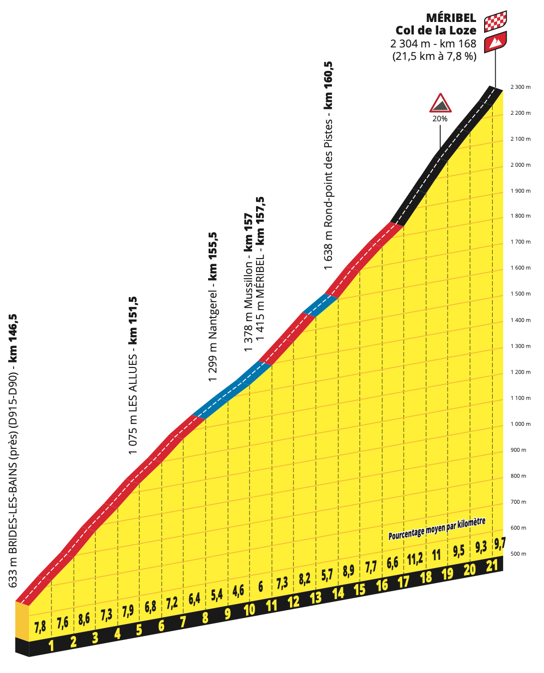
Reporting the average gradient of a climb might tell of the work required but can miss things in between such as small descents which only mean a nasty steep section to come. A good example is the “new” Col de la Loze. The profile shows some steep gradients around 10% above 2,000m altitude so from this alone you know it will be hard work. Only you need to visit to feel how wild the road is, a cycle path that keeps changing pitch, there’s a small descent high up that the profile doesn’t show.
Route surprises are less of a trap for riders and teams today. In the old days you could have one or two directeur sportifs in charge of a team during a stage race but they were busy doing everything, from driving the team car to managing the mechanics. Raymond Poulidor arguably lost the 1964 Tour de France because he didn’t visit the Puy-de-Dôme climb before the race and got his gearing wrong. Today at least one manager per team is tasked with making a forensic report on the course – to the point of boring or overloading riders – and there’s all sorts of mapping tools and software available. Google seems to have become the universal mapmaker but it’s not so useful for the cyclist, the US company wants to list businesses, tourist spots, traffic flow and other data-rich locations rather measure an empty landscape. Many teams use the Veloviewer service which has stage profiles and route maps loaded on and this takes away a lot of the surprises.

One thing that seems a bit off for the Giro at the moment, whether by accident or design, is the vertical gain per day. Take Tuesday’s stage to Sestola, 1,800m of vertical gain according to the race website (cropped screengrab above); RAI used the same number in their stage preview. Only the real number is above 3,000m. That’s biggest difference but some other stages are off too, and the Giro website reports 46,000m of vertical gain for the 21 stages but the riders will log something closer to 49,000m this month. Vertical gain is a useful stat but you can have a stage for the sprinters with 1,500m of vertical gain in the Vuelta, just as you could ride across the plains before tackling a climb with 1,500m of elevation in a few kilometres and a finish reserved for climbers only, which brings us back to the importance of the profile, a quick glance at the profile and the vertical gain for the day and you can narrow down who the likely winners and losers will be.
“That’s the profile for the Giro d’Italia’s Stage 16 via the Fedaia, Pordoi and Giau reduced to scale, a 1:1 ratio on both axes.”
That profile graphic is amazing. Always wondered what it would look like for “real”. A lot less “epic”.
I always think new viewers watching the classics for the first time, who might be used to TdF format of 2000m mountains etc must be confused when a Belgian farmers track is billed as 2000m as well.
Who knew there were mountains in Belgium?!
It would still be epic. Your view point would probably be in space when a 200kmish stage is shrieked to a few centimetres.
Maybe we should use a log scale on the y axis just to really confuse things.
I’ve been using Openrunner for years, after Tracks4Bikers went down. It’s funny how you categorize a difference between “GC” and “sprinter” stages (ask GC candidate Landa). You might as well call them “proper stages” and “ancillary stages”.
really enjoyed this insight, thank you, many years ago I got a geography degree and part of the A Level to get there involved drawing cross sections from ordnance survey maps – draw a straiten line sandpit the contours in at the right point. We think we have it measured but do we really?
This piece is a gem – thank you! Esp love “y-axis doping”
+1 on that.
Reminds me of my grade 4 science teacher who said “If the earth was reduced to the size of a Pinky ball (a 3″ diameter or so pink ball for backyard baseball, etc.) it would be smoother than a pinky ball. Mt. Everest wouldn’t even show up.”)
I’ve been using the phrase ‘y-axis doping’ for a while in my professional life as a scientist. I definitely partook in the practise myself when presenting data. I’m fairly certain I got the term from Inrng.
I find the combined profiles the giro do – each stage on the same scale, following on from each other, a really useful precis of the race and a good way to understand the race and its ‘narative’.
Would love stats programmes to have a ‘make my chart look like giro/tdf profiles’ button. A mammalian cellular growth curve would be a big long climb followed by a short downhill to the finish, one for a Pello Bilbao maybe. Poor oxygen control could lead to something looking like the final week of the giro though.
So there’s the promised Mandelbrot reference! I expected something to do with rider wages and sponsor availability, on a logistic set. Instead, it’s stage profiles, and another brilliant piece, thank you!
Yes, props for the Coastline Problem reference. Was involved in a planning inquiry on cyclesport amenity and had called their head of planning to take him apart on the elevation change around a lap of the circuit being proposed, where they’d done exactly the things you mention to ‘enhance’ the profile.
I seriously doubt any team relies on organiser profiles, especially not when they have to load the route onto riders’ head units.
Great stuff! We’d create our own profiles back-in-the-day with nothing more than the odometer in the car and an altimeter watch – one that required you to wait for a minute or two for the current reading to display. Really made the work slow when you had to decide whether to stop and wait for the reading – was this up or down worth the reading? Then we’d plot the thing out with some basic X-Y axis, using a 1000 meter scale except for the mountain tours where we’d use 3000 meter elevation. We’d often compare them to TCI Italy maps, just-in-case we’d really screwed up somehow.
Total elevation gain was just a SWAG until we got something (I guess it was an early Garmin?) that would add up all the elevation gain. But that only worked if you drove the route start-to-finish the same day and didn’t make any wrong turns! Don’t get me started on trying to do turn-by-turn directions for GPS units….
No matter how sophisticated we got (which wasn’t very) we’d still get clients who would end up with different readings on whatever gizmo they used. All we could say was, “Just like they say on TV, your mileage will vary” with a smile. Hard-to-believe that Giro stage was THAT far off?!
I’m sure few have a clue as to how much work it is (or was) to create things like these. I need to make some for rides here in Sicily, need to find that Garmin thing…it’s around here somewhere 🙂
Really appreciate site perhaps it is the “New Yorker” of cycling sites. Long form pieces, short form pieces, obviously on topic, and wonderfully chasing down rabbits. Thank you.
We have so many different data visualisation possibilities available now.
I’d love to see a plot of “watts required to go at a constant speed” for a reference rider (weight, rolling resistance, cda). This would give an indication of both gradient and wind. No reason why it can’t be dynamical generated to take account of the current weather conditions.
I suspect some team/s have got this type of calculation going, the difficulties would be plotting in weather and just how “good” the rider feels on a given day perhaps?
But just think of the huge amount of data at a team’s disposal, every stage / one day race is on their power meters. Do that for every rider, over several seasons, and there’s surely magic to come out of that.
Potentially a team could plot climbs / courses that are used regularly at an average speed and find out the watts required.
Use it to develop a diet strategy (in-race and afterwards) to refuel and, hey presto, you’ve got a watts stage profile?
Why not, as Larry T says, the F1 teams calculate a fuel strategy in a car race (albeit on a circuit) and a similar thing may be do-able for a cyclist?
Sky released something just like that after Froome’s win on stage 19 of 2018. (Or, rather they released it during his Salbutamol investigation.) See the link above.
It goes into some detail on the power required , and therefore the calories required, for each part of the stage, together with the 11 locations where soigneurs would be standing with bottles and gels.
Yes, you’re right.
Over time, this data will become more detailed and robust also.
It won’t be long before teams can download an entire day’s profile into a smart trainer also, and have their riders ride a virtual Giro in training, if that day hasn’t already arrived?
Some teams are doing things like this already, trying to work out the effort required each day and within the stage, for different sections of a course using software. A lot depends on the tactics on the day etc but can mean riders changing what they eat and drink along the way.
Very interesting. Can’t believe how much the Sestola stage was off – why would that one stage be so inaccurate?
I’m always curious that my GPS elevation screen allows independent changes to the x and y-axes, and have wondered if a random sample of cyclists would coalesce around a certain ratio that makes a “hill” look like it feels.
Great stuff, at the local level there is also the issue of combining data sources.
Frequently the 2-d map data is collected at a different time and resolution to the 3rd dimension.
Most mapping was originally 2-d and then has elevation added afterwards, sometimes called 2.5d.
A well known ride tracking website has some interesting artefacts that reflects this
More than one website has this issue. You can upload the same ride to different websites and get varying numbers for the vertical gain with different maps, corrections etc and you device might not be right because of barometric change. It’s hard to get the accurate number sometimes.
I did LEJOG with a commercial operation. They provided GPS and stage profiles for each day. Unfortunately many individuals fell for the same trap of failing to fully interpret the data. Thus, the first day through Cornwall to Okehampton was a baptism of fire for some. Apparently one of the riders complained that he had tailored his training specifically for each day and wanted a refund because it was much more vertiginous that the operator had presented.
It begged the question as to exactly what form the rider was coming in to that his schedule would be thrown out by this and to what end. Needless to say no refund was given, but an explanation of how to read profiles was provided. Priceless.