 I’ve enjoyed the Mountain High book and its sequel Mountain Higher. On the back of this the publishers have released an app for Apple devices. Armed with a friend’s iPad I took a look.
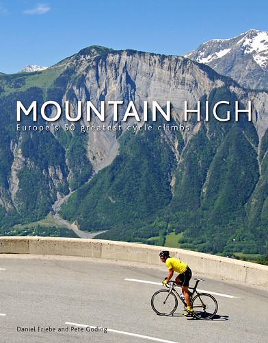
As a reminder Mountain High was a pleasing book. Stunning pictures by Peter Goding, diverse stories by Daniel Friebe and informative graphics saw the book marry the mountains, pro cycling history and cycle touring into one. I found that if you’re unable to experience these roads then the book was a great alternative.
So what’s the app got that the book doesn’t?
Actually it’s better to start with what they share. You have over 50 climbs and like the book there’s information on each of them. There’s the standard fare like location information and profiles but it’s worth noting they’re accurate, not always the case. There is an error with some height data as you’ll see below but the beauty of digital documents is the ability to download a replacement copy.
Ride Thru
Software design and layout matters a lot more than the pagination of a book so here’s a walk through the experience. You can list climbs alphabetically, by country, height or gradient but there’s a map view with Monte Zoncolan highlighted in green.
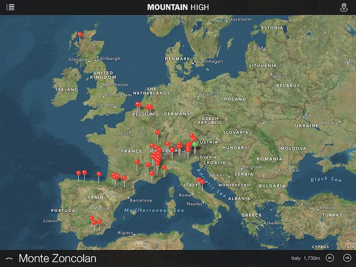
As you can see this is Euro-centric, the a Scottish climb thrown in as a bonus from Mountain Higher, a point we’ll return to below. By sliding and pinching you can zoom right into the climb if your choice. Next you can go to more details on the climb
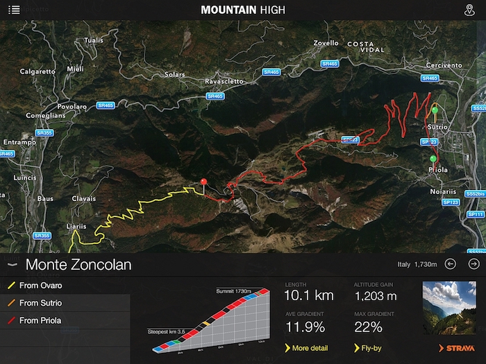 You can see the summary information here but it’s only the start of things. Tap the profile or the “more detail” link and a larger version of the profile hovers in the middle of the screen. See the square image on the bottom-right? This just looks like a picture but tap it and get taken to the richer content. For this user it wasn’t intuitively obvious that the image would lead to a lot more, it’s the equivalent of a small doorway.
 Having tapped on the photo you get to the larger photos and can swipe across five images of the climb whether panoramas, hairpins or other features, for example the “monument to the climber” on Monte Zoncolan. The original book’s photography by Pete Goding was excellent and now it’s in digital format to browse. After swiping the photos you can start reading with the “continue reading” link.
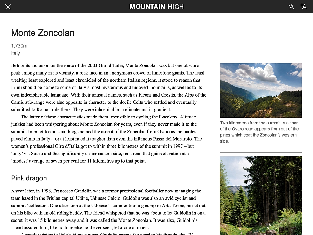 If the images are rewarding the writing is often as illustrative with rich descriptions and alternative anecdotes. A lot of cycling history can be reduced to Eddy Merckx but the writing accompanying each climb here is varied. It’s not “and here in 1971 Eddy Merckx attacked and won”. At a guess there might be 1,000 words on each climb and it’s invariably a good read with a variety of stories, perhaps some history from when the Tour first visited but equally likely a modern tale or a discussion, for example a lament on the Muur de Geraardsbergen’s exclusion from the Tour of Flanders or, for the Col de Joux Plane, a discussion on what makes a hard climb, statistics or something intangible? It this part that’s the best and in terms of volume and time spent, this more an e-book than an app.
App vs Book
If you have one should you get the other? The app does bring more information with interactive maps. I like the book for its physical presence, it’s heavy and the photos are so big that a single page is larger than an iPad, some photos are spread across two pages. But the book obviously sits on a shelf or the coffee table whereas the app can be whipped out in a coffee stop on your phone albeit only if you have an Apple device for now. The choice is as much about technology and reading habits although note the app is cheaper.
Note it didn’t crash once during several sessions spent browsing. The fact that it worked shouldn’t be remarkable but if only every app was as stable.
Mountain Higher 2.0
The app comes with interactive links to Strava as well as online retailer Wiggle and travel website TripAdvisor. The Wiggle and TripAdvisor link just seems to be some sort of affiliate tie-up. The Strava link is more promising with “official” Mountain High courses although a quick look reveals some odd choices in the routes. The Strava segment for Alpe d’Huez starts in Bourg d’Oisans rather than the usual “campsite” location at the foot of the climb although the book and app show the profile as with the standard start. Also if it finishes on the Avenue Rif Nel, the Tour’s finish, it goes a different way through town and ends up descending the Rif Nel rather than the traditional slight rise to the line. It’s not “The Tour Route” but perhaps chosen for better views. The same for the Ghisallo climb which starts in Bellagio rather than the normal Lombardia start at the roundabout.
The App has one climb from the second book Mountain Higher, Scotland’s unpronounceable Bealach na Bà which made me wonder if there’d be another, separate app for Mountain Higher. It’d be a concern if the publishers end up issuing a separate app for each book as having two apps seems self-defeating for users, to close one program and open another means you can’t hop from place to place so easily. I’ve asked and there are possible plans for a Mountain Higher app but likely as an “in-app” purchase meaning if you get Mountain High app you could add the second set of 50 climbs in time. But beware this is not confirmed, just some thoughts from the publisher.
Summary
If you liked Mountain High you’ll find the app has some more interactivity and if you have an iPhone, fits in your pocket but there’s an obvious overlap. If you don’t have the book here’s a cheaper way to get it and enjoy the content. There’s plenty to interact with but the best part is rich content from the book that’s been imported.
You’ll find it on the Apple App Store at £4.99 / €5.99 / $6.99. There’s another app with the same name – for the ski resort recently visited by the Tour of California – so look for the cycling logo.
Disclosure: this app was sent free for review.

I bought this and although it is a great app I was a bit annoyed that there was an ad for Wiggle. I’d rather it was free of any advertisements, the link to Strava at least adds functionality.
How intrusive is the ad exactly?
You can see the screen grabs above. The logo/link is small but quite visible.
Bought and downloaded! So far an enjoyable experience. So much on each climb, this an app to return to day after day.
I think that you are missing the word “ride or experience” in the first few paragraphs.
Always informative
thanks
80% of all new phones on Android these days and companies still only release iPhone only. Why?
I know that the guys at ProCyclingStats have been asked the same about their forthcoming iPhone app… their response is something along the lines of most of their users are on Apple devices.
So how about a link? Mountain High on the App Store is a snowboard app.
Search and you’ll find, it’s got a yellow icon with a cyclist on it.