
With EF Pro Cycling fashionably late, all the World Tour team kits are out. Got any favourites? Of course and what would the internet be without rankings of team clothing? Instead let’s reflect on identity and branding because what’s striking is how ordinary so many jerseys still are, plain kit with logos slapped on.
It’s remarkable how many team kits are still textile billboards, with jerseys and shorts giving as much prominence to the sponsor logo as possible. Work overalls with sponsor labels.
Now let’s abstract ourselves from the 2022 team kits to consider the underlying designs. Regular jerseys sold by premium brands like Assos, Castelli, MAAP, Rapha, Sportful, Velocio and others has, well, had some design to it. If you want, say, a red jersey, they won’t give you plain one but instead have some design to it with patterns, blocks, fades and so on.
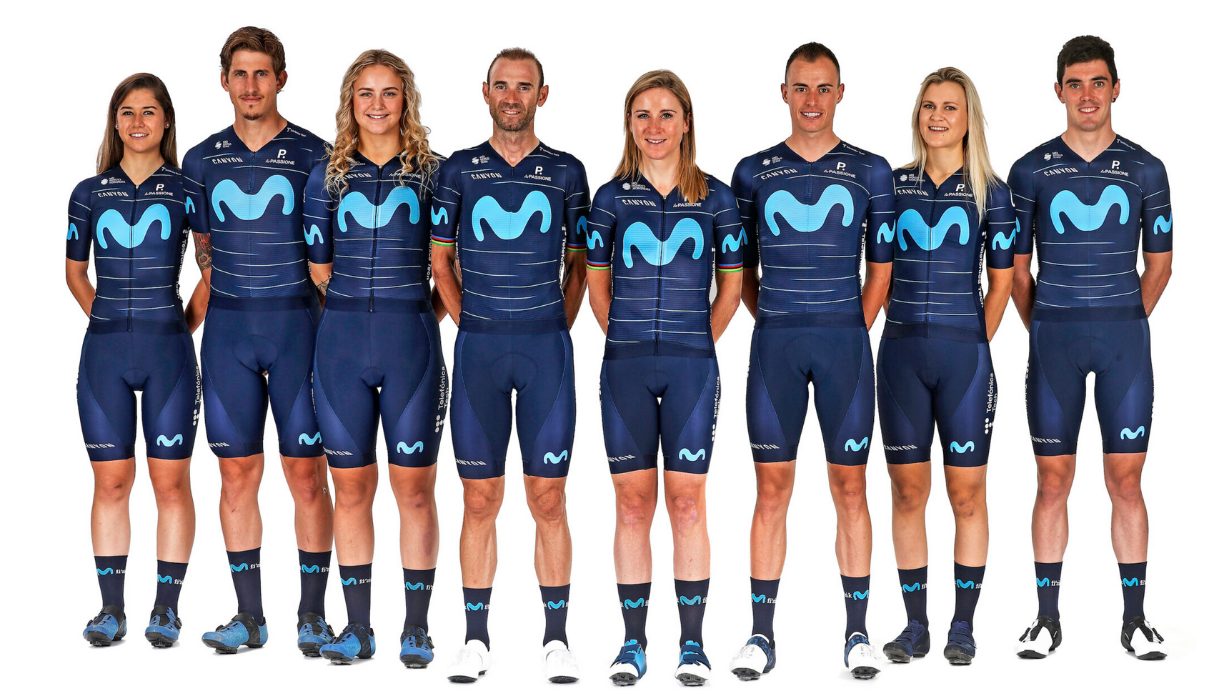
Strip the pro jerseys of their sponsor logos and there’s a mix of very plain jerseys and a few with patterns. Movistar’s kit is a good example because it’d works as well without the Movistar logo as it does with, if you were in the market for a navy blue jersey you’d consider it, no? Cofidis, Ineos and Bora-Hansgrohe are among others with kit that could sell well in plain versions too, not enough to pay for the team’s budget, more that it has wider consumer appeal beyond the team’s fanbase. Having a good canvas is the start of a good jersey.
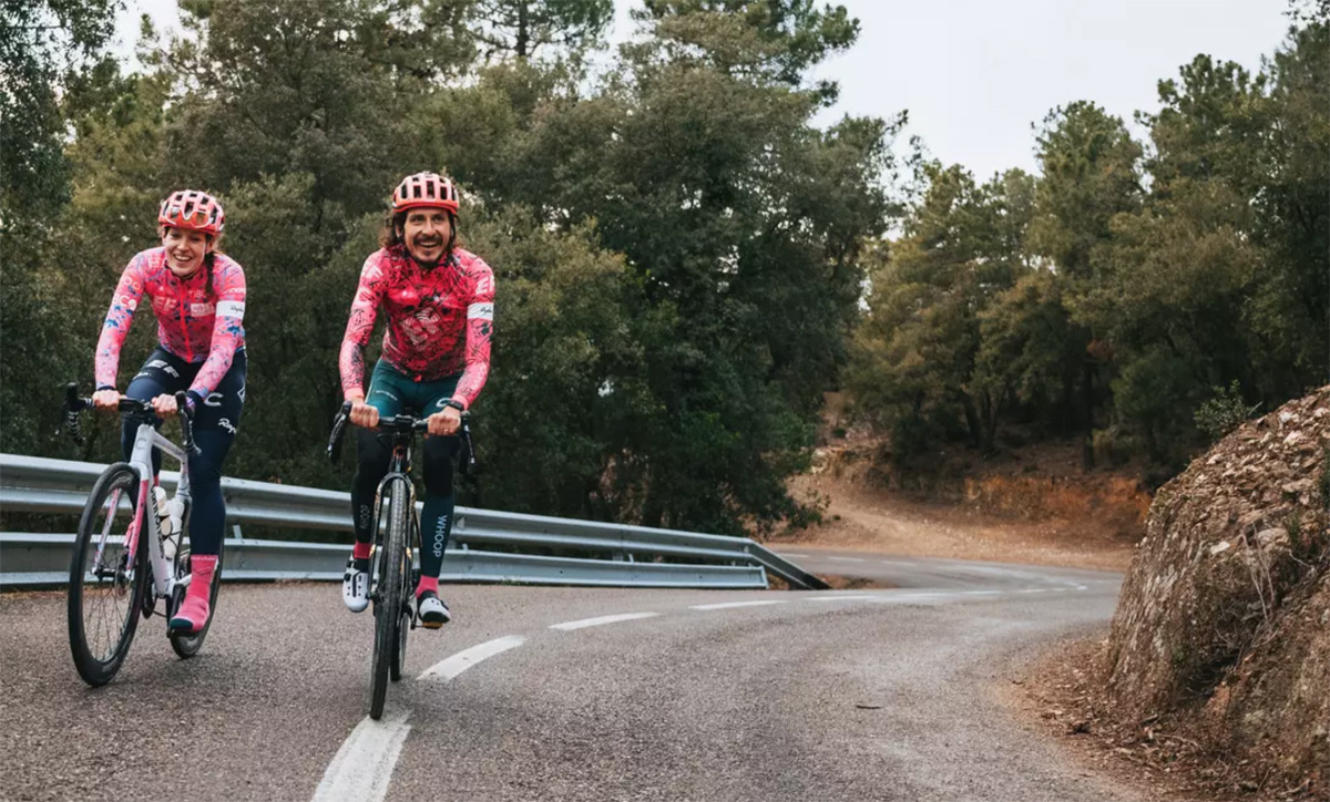
Next let’s consider identity and branding. Imagine if the EF kit was released with no sponsor logos but all the same colours and patterns: you’d spot it right away because it you knew it from last year and it stands out. Other examples come to mind, you know Astana thanks to the enduring national colours. Groupama-FDJ’s tricolore has to be them, and Groupama, a company with a green logo, has bought in. Ag2r Citroën’s jersey would be plain white but the brown shorts are the giveaway. Some like Jumbo-Visma could be quickly identified if they had no logos but the colours are very much the corporate tones, the Jumbo supermarket uses the same yellow and black and if the day comes when the team changes sponsors, would they keep the same colours and identity? Maybe not so it’s recognisable but perhaps not as enduring.
Being able to spot kit without reading the logos is valuable branding. Consider some of the biggest consumer brands, you can tell a can of Coca Cola without it having say “Coke” on it thanks to the colours and design. A luxury handbag might have a strong identity thanks to the clasp. A Porsche car might have a logo the diameter of a cupcake but many can recognise one of their cars from hundreds of metres away. Such branding is rare and can take decades of design and promotion to create and sustain. If you can tell a team kit from afar without being able to read the logo then that’s got to be valuable. Now as the reader of a niche cycling blog you can probably tell all the kits, but being able to do this with a wider audience, the millions who sit down to watch a race on TV is valuable.
Look at advertising on TV and online these days. When a TV show cuts to the ads, or you scroll through Instagram, you don’t get, say a “Soudal” logo beamed onscreen for five seconds like some 1950s ad campaign. Instead there’s usually a short story and imagery about the product. Of course a jersey can hardly tell a story but as suggested above, it can still have an underlying design that’s appealing and an identity that makes you “know” it even before you can read it.
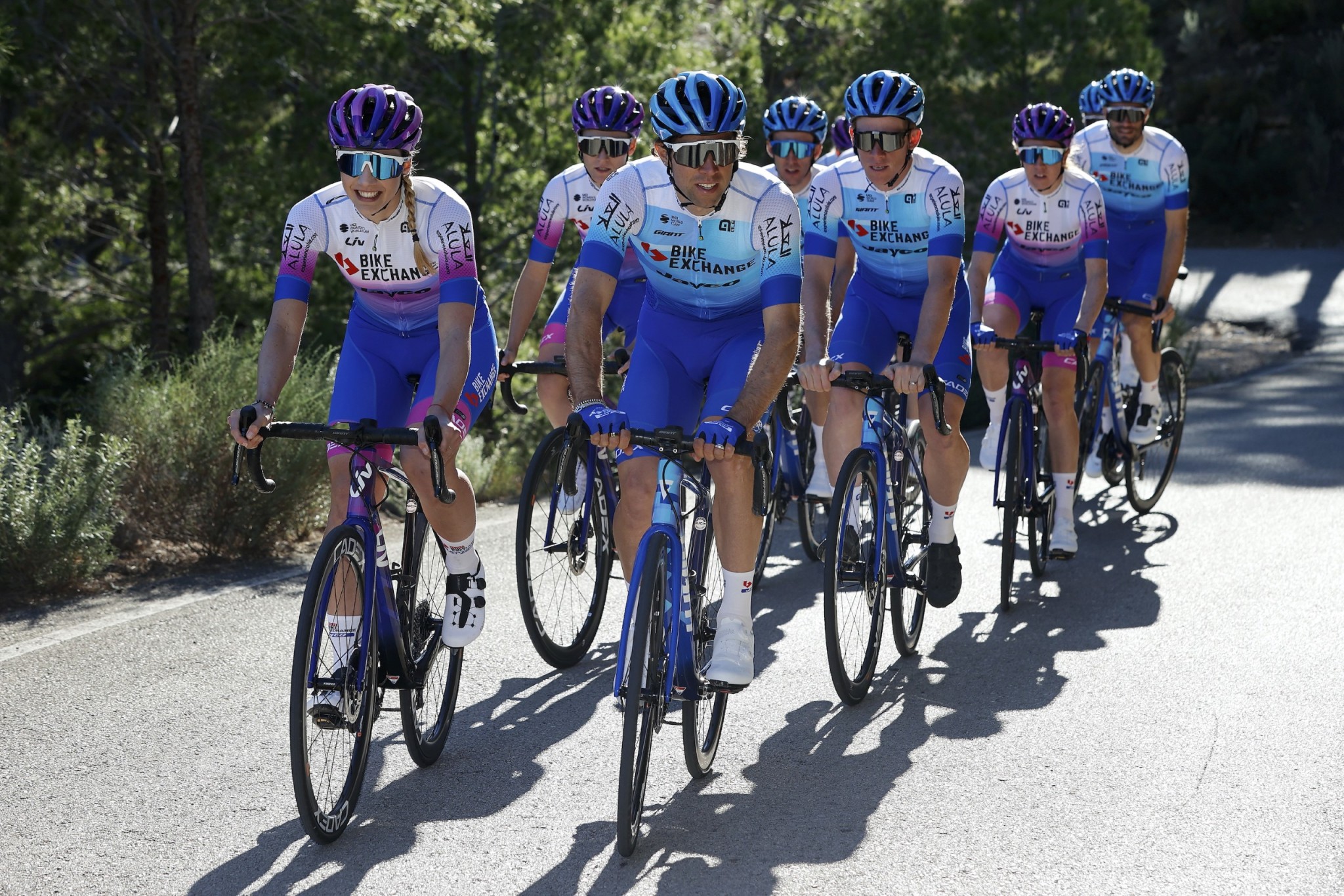
Which brings is to Bike Exchange’s 2022 kit with the blue design. You may love it, you may hate it, worse you may be indifferent. But if you saw the kit without the big “Bike Exchange” and “Jayco” logos then you’d have little idea which team it represented, nor would the underlying design appeal much either. Now the kit is new and they could try to build a brand from this but that’s a hard job given blue shorts, white shoulders makes them similar to Israel and Quick Step and even Intermarché-Wanty.
So if you can spot kit from afar without having to see the logo, how much is that logo’s and the real estate worth? This will vary across the teams, some sponsors do want that “here’s our brand” analogue banner advert and a corporate sponsor is unlikely to argue for their logo to be smaller, after all they’re paying millions. But how much of the value comes from being able to read the logo? Some sponsors want a different kind of rapport, it’s less about eyeballs and more about making an emotional connection. To reprise the EF kit again, yes the logo takes up a lot of space on the front but it’s subtle at the same time, a pattern amid the patterns rather than the corporate letterhead sublimated onto the jersey.
Lastly yes, kit can have a commercial function in replica sales but delve into team accounts and this is small, even for the biggest of teams. And there’s also the need for riders to be able to spot each other in the bunch, something which can’t be overlooked when it’s being made and where we’ve seen with the women’s World Tour, some kind of collaboration between teams or oversight from the UCI can come in handy to stop teams from mistaking each other… because if you’re own riders are confused, the waiting public is going to fare even worse.
Conclusion
What’s the point of team kit? Some of them are textile billboards and it shows, blank kit with little underlying design onto which corporate logos are printed so you can read them on TV, online and in print. Some sponsors crave this. But others don’t need the logos to be so strong and this is the interesting part, the more you can recognise the kit without having to read the logo then better, a connection has been made, you’re being fed the brand without having to read it and the stronger the team’s identity.
I always find the season’s first few televised races frustrating as identifying teams is difficult. Why do they need to change so much. Lotto Soudal is good because classic, stable and easily recognised. Bike Exchange – as IR suggests – is bland and confusing. They didn’t even need to change as it’s still the same sponsor (Gerry Ryan) even if the brand on the jersey changes. More continuity helps even for an avid observer like me, so chapeau: Lotto-Soudal, DSM, EF, Movistar, Astana, Jumbo, Arkea, Alpecin… for the jerseys if not always for the culture. Merckx wore more or less the same off-brown Molteni jersey for six years and made an easily recognised classic.
I completely agree with this. I do like the way Bora has been mostly steadily playing with the same colors and sponsor font/layout but keeping things fresh, though I hope they’ll pause and let us enjoy this year’s iteration for several years, because it’s a winner.
Bora’s have been decent (not seen the latest) although along with last year’s Bike Exchange kit I felt there was a lot minty green/blue going on. Toothpaste tube vibes.
Having said that I wouldn’t fancy coming up with a design which stood out with so many teams and so much of the colour spectrum used up already. You can’t even go stripes or hoops either as they tend to look a bit ugly on bike kit for some reason.
The story goes that the classic Peugeot kit with its black and white checkered pattern… was designed for black and white TV, you could spot it easily.
Trek until recently had tried some stripes but they were not so visible on TV, more an identity for the kit up close, they used the “show your stripes” slogan… but that’s all gone now.
Interesting, I suppose Vaughters had his argyle motif going on for a few years but they seem to have dropped that. Maybe the time is right for neon-argyle pink, if you’re reading Jonathan?!
Yes, I was going to mention that in the piece but it was getting long already. The team used to change sponsors almost every year but the argyle design was a consistent theme in the background. But the team isn’t Slipstream anymore, it’s been bought lock, stock and barrel by EF Education.
In fact the new EF Education kit does feature a return of the argyle motif. It’s subtle, but it’s there.
Ha ha! I heard that one about the Peugeot jersey and being visible on TV. My team when I raced as a midget – yes, that’s what they called us 10-12 year olds – was black and white. The TV anecdote reminds me of the Gibson LP Special guitar. It was a low budget guitar finished in a faded yellow. The story, or myth, is that white guitars got washed-out on black and white TV due to the strong lighting and nature of TV in the late 50s. So, they finished them in a yellow color, and, voila, the name TV yellow was born. Closer to the truth? A lot of TV furniture from the 50s was finished in a faded yellow that was widely available and cheap. Les Paul was cheap.
It’s obviously subjective but I like EF’s the best in a zeitgeist sense, it’ll probably look terrible in 10 years time though and cool again by 2040.
“Terrible in 10 years.” Yeah, isn’t that how it always is? Like looking at pictures when you were a teenager.
Is your conclusion based on anything other than subjective opinion? As much as I hate to type this, perhaps some professional marketing-mavens with proven success need to weigh in? Some think pro cycling team merchandise can (and should be) a gold-mine. https://www.velonews.com/culture/the-outer-line-nascar-and-pro-cycling-different-but-similar/
But if you take FIFA big-time football as an example, are those jerseys sold because of a great design that works without (or despite) the sponsor logos? Some of them are iconic, others pretty non-descript. Do sales reflect the team’s success, a following of a certain player or just how they look?
What I find puzzling is WTF pro cycling teams don’t make a bigger effort into having a kit that can’t easily be confused with another? The silliest example has got to be the women’s teams who decided for 2022 a blend of pink/purple/orange is the look they want. On the men’s side Trek-Segafredo and Lotto-Soudal looked way too similar in 2021. UCI really needs to step-up here IMHO. First-come-first OK’d with jersey design for the next season with refusal for any that come in later that look too much like what’s already been submitted and OK’d. North American franchise sport teams don’t have these issues, one can easily tell the NFL Vikings from the Packers on the field of play.
Larry’s word of the day: “marketing-maven.” It apparently can be used as an insult, or as an appeal to authority. 😉
And Larry, you flip out at the idea that apparently there are lots of people out there comparing cycling to FIFA football or the NFL, and yet it seems like you’re often the one bringing up those comparisons.
There are a lot of experts on things that are just that – experts, whether I like what they do or not it doesn’t take away from their expertise, does it? I can’t use NFL for a comparison because I’m not a fan of plutocrats who get the public to buy them stadiums for their teams to play in and then charge the public to get in? OTOH in some ways the NFL is more socialist than pro cycling with salary caps, player drafts, etc. Meanwhile, nobody is going to confuse the NFL Packers with the Raiders on the field – can’t say the same about SDWorx and HumanPoweredHealth.
That’s true with the NFL, but they are (franchise moves notwithstanding) city-based whereas cycling teams are so business focused in their branding and relatively transient. Harder to get a grip on the latter if you’re a fan and build a relationship.
I suppose the NFL still has a lot of colour clashes (Bills/Giants, Eagles/Jets, Cardinals/Chiefs) but the nicknames / marketing is so good it easily supersedes it. Interesting discussion (for me anyway).
The Green Bay Packers have been the Green Bay Packers since 1919. Ironically (based on your complaint of plutocrat owners), they are owned by the Green Bay community. They’ve had their iconic colors and football-shaped ‘G’ logo for over 60 years. The Vikings are youngsters, having been formed in 1960. They’ve had their iconic purple and gold colors and “Viking” horn helmets since they were formed. It’s hard to look to NFL franchises with that kind of consistency and longevity for clues to how cycling teams should handle their kit. Given that there is rarely any connection from one title sponsor to the next, it’s not surprising that when a new primary sponsor comes on board they want a dramatic change in kit from the old sponsor. Lousy for fans, but would new sponsors come into the sport if they couldn’t have almost complete control over the look and branding of the team?
I mentioned the socialized aspect of the NFL but didn’t see the need to go into the specifics of the Packers, but of course you did. Would you be happier if I’d used the NBA? My ONLY reason for bringing up the NFL was that they make sure TV viewers can tell one team from another on the field. NASCAR does it with giant numbers on the cars which some have suggested be done with the riders….not an idea I like.
UCI should put more effort into making it easier to tell one team from another IMHO. The idea of teams having different kits for different events would really make that a challenge, but obviously some don’t care. They seem as much interested in the fashion vs sporting aspects of racing, an idea that would really make the TV commentator’s job a challenge!
One, I agree that it should be easier to distinguish one team from another in cycling, and I agree that the UCI should go much further in enforcing this distinctness. At the same time, I also appreciate when a star on a particular team is additionally easy to spot because their helmet or bike color is different. Seeing GvAs gold helmet or Sagan’s iridescent or red/white/blue helmet popping up in the bunch sprint from the finish line camera is a huge help to being able to tell what is going on. I think rider names on the jersey shoulders would also be nice, though very non-traditional.
Two, I think team differentiation in cycling is dramatically and fundamentally different than in just about any other sport. Cite the NFL or NBA all you want, those are sports with two teams and many fewer participants on the field. Different teams in water polo are even easier to spot in play, again because there are two teams and all we see are their swim caps in two highly contrasting colors. In car racing the paint jobs and vehicle shapes usually make them distinct. But in a 60 rider peloton, with cameras at a distance in a helicopter, you can usually only see a tiny bit of each rider, many teammates wear different helmet styles, the bikes all look identical at a distance, etc., etc. It’s an extremely difficult problem that is made worse by busy jerseys that end up functioning as camouflage at a distance. Yellow and pink and green and cyclamen jerseys for leaders are a huge help for spotting key individual riders, but obviously there have to be strict limits there. More could be done to make it easier to different cycling teams at a distance.
Three, allowing teams to change their jerseys throughout the season between two or even three iterations should not be a challenge for fans or commentators, and would probably help things. The change would be for the entire team, and as long as the jersey variants didn’t come close to another team’s design/colors, it would be perfectly clear. Are fans and commentators really unable to identify teams early in the season when every team is in new kit? It seems like the only problem is when two or three different team kits are remarkably close. In the last couple of years I’ve watched races where 3 or 4 different teams had very similar bright orange jerseys, and I was constantly confused. If those teams could coordinate before the race, so that several of them switched to a related variant jersey, clarity would be enhanced. This is, after all, what virtually every other sport does when teams basic jerseys are at all similar.
Michael B, you mention that a few NFL jerseys clash, but of course the standard is white jerseys for the home team and colored jerseys for the visitor. This works very well, and supports the idea that cycling teams shouldn’t necessarily be locked into a single kit design throughout the season. Let a team have pink jerseys for the TdF and yellow jerseys for the Giro, for example.
Yeah, I hadn’t really noticed how the NFL force teams to wear white so often, but you’re right, they do even when there isn’t a clash.
I just had a look at the 49ers and Cowboys from a fortnight ago, as I watched that, and both were wearing their “home” kit so not entirely sure what their rules are.
I wonder if it’s to help colourblind viewers? i.e. you’re never allowed two “dark” kits against one another but Cowboys vs Dark Kit is fine. Alight tangent, sorry!
KevinK – “Three, allowing teams to change their jerseys throughout the season between two or even three iterations should not be a challenge for fans or commentators, and would probably help things.”
HOW would this help things?
“If those teams could coordinate before the race, so that several of them switched to a related variant jersey, clarity would be enhanced.”
You mean like SDWorx and HumanPoweredHealth are (so far, not) doing?
I think the motivation for kit sales in football varies – some of it is tribal (“my city”) but there is a global market for the biggest teams (who haven’t really changed all that much, although sadly Italian teams have faded since the 90s glory days). Some suspicion that the trend is towards global fans supporting players ahead of teams (eg Messi rather than Barca or PSG).
Barca, Real Madrid, Man Utd, Bayern Munich etc – do have shirt sales in the low millions but the reality is it’s not as big a generator of revenue as people think. Loose change for the biggest clubs whose revenue largely comes from broadcast rights followed by sponsorship deals and gate receipts.
The smaller a club, the higher proportion of revenue they derive from merch sales to a local audience though, so there are proportionally bigger benefits for clubs way down the football pyramid in my country (England) where there are 125+ fully pro men’s teams and thousands of semi-pro clubs.
My feeling is that even in cycling’s heartlands people relate and have real passion for riders and specific races, rather than teams. I’d definitely wear a nicely designed T-shirt with Roubaix, Flanders or Giro iconography but would run a mile from any trade team kit*. I think that’s a bit of a gap in the market but it’s a pretty small market compared to football.
*different rules apply for retro kit!
tl;dr – I think people relate to races not teams and there’s an opportunity for increased merch sales here – but the market is minuscule compared to football.
For a sport so closely aligned to the aesthetic, the team kit designs are probably the element with the least impact.
Which is odd, given that the riders themselves are the central characters in the entire picture.
But, as fans, we seem more concerned about what’s happening with and around them than what they’re wearing.
My view is that the team kit is ‘associated’ with the rider / team, rather than having a stand-alone brand strength.
Some kits can become iconic but more for what the rider achieves, though there are a few exceptions.
I find kit design usually follows cultural, fashion and design influences of the era in question anyway. From the 60s iconic Peugeot chequered squares (very Mod), the browns, oranges and yellows in vogue in 1970s fashion (of which the Molteni jersey was a prime example) to the psychedelic overtones of mid 80s – 90s that were seen in many dance and music fashions of that time and which found their way into the peloton.
The simple block colours favoured in the past 10 years or so also mirror contemporary cultural tastes seen in clothing, motor cars etc.
I think that the team kits would tell non-cycling fans that may watch the occasional grand tour or race very little about the brands they’re supporting.
The value to the sponsor is it’s association with success, and a team kit whose design the public can broadly culturally reference, even if it is block black, which is all the better to clearly show a brand name.
I’d definitely wear a nicely designed T-shirt with Roubaix, Flanders or Giro iconography but would run a mile from any trade team kit.
Same here.
Couple of years ago Sportful had such jerseys, I bought myself a Tirreno Adriatico, but there was a Milano Sanremo design and probably other Italian races.
And there is one particular jersey I wish they made a replica, the Il Lombardia jersey made for Felice Gimondi for his 70th birthday.
I almost never see people in modern team kit.
I was overtaken by somebody in Alpecin kit this morning
Kit isn’t and won’t be a goldmine. But find any book on advertising, branding and imagery and they’ll tell you the strong brands are the ones you already know and can even spot without being prompted.
But that ‘brand’ would be the team, not necessarily the sponsor, no? For football jerseys, I can recognize someone in a Barca shirt from far away. Then when they come closer and I can read the sponsor name I know roughly when they bought it. So to what extent does having a recognisable team jersey benefit the sponsor? Or are you arguing that teams could advertise themselves more as a brand?
Doesn’t the NFL have a specific rule requiring one team to wear its coloured jerseys and the other team its white jerseys? And the advantage of only 2 teams per match!
The football (soccer) shirt sales myth: https://www.danielgeey.com/post/the-shirt-sales-myth/
Tangential but related to this post, I think the allowance for teams to have special jerseys for the TdF is something that should be adopted more widely in the sport. If a team wants to go to the expense of creating different jerseys for different races or different markets, and as long as they’re not confusing or infringing on another team’s designs, then it’s a good thing.
Last year my wife and I voted for our choice of the Jumbo Visma special edition jerseys, and then bought ours in advance so we could have our names on them. I was looking forward to looking at high-res close ups of Roglic on the podium of an early stage and picking out our names on his jersey. It was a cool promotion, and the jerseys looked quite a bit better than their usual jerseys. More teams should do things like this and what EF has been doing.
It’s a good idea and gets fresh attention. Under the rules – which can always be changed – teams can have one change or one special jersey in the season. As much as the change of kit, having a story to go with it probably counts for as much, the “why” counts for plenty.
Curious if the “one change” is only a single time. I think it is. It would be nice if a team could switch back and forth between their two chosen kits, perhaps something dark for spring and fall races, and something less dark for summer. And I think you’ve mentioned previously that it would be a great deal for sponsors if the team could change kit when in different countries, so perhaps a Belgian sponsor would be the main jersey logo for Benelux races, and a multinational sponsor outside those races. I imagine some secondary sponsors might pay a little extra for that privilege.
Good point! Keeping things “fresh” is vital. In my opinion, the EF kit was starting to wear thin with that all that pink, rose, salmon – whatever you wanna call it. They needed to break it up – and they did. Well done! But what’s with EF’s shorts? Dark seaweed green?
And as far as the number of team kits sold, I never see many cyclists decked out in full kits. Limited edition kits seem more attractive. I remember Santini was selling special kits for particular stages of the Vuelta. I imagine they’ll do the same now that they have the jersey contract for the TdF. Great blog Inner Ring.
“allowance for teams to have special jerseys for the TdF is something that should be ” VERBOTEN!11! by the UCI
This is the most fuck up thing in cycling in the last few years. By the time you just begin to get comfortable with the seasons new kits and rider changes, some teams come up with a total different jersey for the Giro or Tour, just to add more confusion to fans and commentators.
I’m impressed that we made it through this article without an Androni picture
The Intermarché kit’s a lot like that as well, an assembly of sponsors built together to keep the team on the road. Three title names with Intermarché, Wanty, Gobert. Shorts with different sponsors on the left and right, plus a third name on the rear panel and so on. But recognisable as the fluo touch on the shoulder has been there for some time.
I loved the older version of the Wanty Group Gobert kit. I was living in Maastricht a few years ago and the squad were training there. I asked if I could buy a jersey but they weren’t even selling them on the company website at the time. The Roompot one was also cool in Dutch orange.
Androni is often my favourite. I like the multi-sponsor look.
I thought one of the more successful jerseys for brand identity was the original Bahrain-Merida jersey. To me the colors, added graphics, and gold helmet made clear the team represented a Middle Eastern Kingdom.
Good shout on the Bahrain jersey, it is one of the best. It reminds me of the cover of The Rider by Tim Krabbe: https://tinyurl.com/ywd75ntx
Like,
EF Education PALACE special jersey and especially on Ruben Guerreiro.
https://www.cyclingnews.com/news/giro-ditalia-ef-education-nippo-set-to-unveil-new-kit-that-will-give-everyone-a-warm-fuzzy-feeling/
I’m not sure where the error is in that headline – is it EVERYONE or WARM-FUZZY-FEELING? “Everyone” had a feeling about it for sure, but not all of them could be described as “warm-fuzzy”. When I first saw it I thought (trying to be charitable) “Well, it’s not as awful as the old Footon-Servetto kit, right?” But there’s no doubt it worked well from a PR standpoint…whether anyone knew or cared what the sponsor was marketing. Are people who watch pro cycling also likely to buy this type of fashion clothing?
Maybe LVMH should equip their teams with Pinarello bikes and LV luggage as well? Check under the INEOS team bus…are they way ahead of me? Why doesn’t the team toast victory with Moet? (Wiggins made fun of them one year for using cheap prosecco from LIDL) What brand of cognac is in the bus’ liquor cabinet? Dior or Fendi could make their after-ride clothing. Is a TAG-Heuer watch too low-brow? How ’bout Bulgari? The possibilities are almost endless! 🙂
My favourite kit for many, many years.
It seems strange that with so many teams fighting over various combinations of red, white and blue, green has been largely overlooked. Which to pick out: Sanson with Moser, Crédit Agricole, Caja Rural, Cannondale (a brilliant design), and does the current Bora count as green?
+1 and same for your earlier post above. On that one KevinK and yours truly can agree on something 🙂
You can’t get a greener green than Team Europcar – just like you couldn’t get more orange than Euskaltel-Euskadi. Both were established brand colours and were easily distinquishable and instantly visible in the peloton.
It didn’t hurt, either, that the design remained essentially unchanged from year to year. (Liquigas/Cannondale’s green could be a slightly different nuance one year and it could be more of a secondary colour the next.)
Lampre had a bold and unique combination of colours, too, and one that stayed the same even when the design was changed.
AG2R had a jersey that slowly grew on you and together with the brown bib shorts it was everything that brand builders want to achieve. That’s why the new jersey was a bit of a shock – but give it a few years and you’ll probably miss it if or when Citroën leaves the sport:-)
Don’t forget Legnano https://en.wikipedia.org/wiki/Legnano_(cycling_team)
They were around for only 6 decades after all! You might note the similar look of the jersey I’m wearing in the tiny photo up there at the right.
If sponsored jerseys don’t say anything about the sponsor, well the Castorama ‘overalls’ one did, but was absolutely hideous !
As for them all looking the same, perhaps good taste limits them to a certain number of colour combinations – EF pink isn’t so common because it’s pushing taste limits, LeakyGas had some lime green, Lampre a bit fuschia, but brown’s not so attractive and there have been some dreadful AG2R designs in the past, though the current AG2R Citroen one is actually pretty cool
– but not the execrable Footon one from 2010…
So you probably hated Carrera’s kit from the Chiappucci/Pantani era as well? I know plenty of people who liked both – though they’re probably the same folks who think EF’s 2022 kit looks like a case of Pepto-Bismol not working to stop vomiting. Are the shorts black or green to go with that jersey? I’ve seen a few photos of both and the green ones really, really look terrible IMHO.
But at the same time, they’re not selling ANY of this s–t to me as the last team kit I wore was decades ago when “Swisstex” material was (as Hambini says) “the shizzle” As close as I come these days are some old Giro d’Italia long-sleeved ones from Santini – a blue with Mediolanum logo and a red with Algida’s, blow-outs from Prendas after the Giro start in Ireland I guess?
Surprised this atrocity hasn’t appeared yet…
https://www.theguardian.com/sport/100-tours-100-tales/2014/sep/17/uci-indecent-cycling-kits-colombian-womens-team-flesh
I was walking with the family to the local open-air market in my neighborhood in Amsterdam this morning and did a double take when I saw the new TotalEnergies logo on an innocuous cluster of dark green metal boxes on the edge of a pocket park. I assume the boxes were housing gas or electric monitoring equipment or relays (or whatever) for the nearby apartment buildings. The boxes were pretty small and the logo, in white, only a few cm in dimension, but I recognized it immediately and though of this post. It struck me as a rather unobtrusive and elegant symbol for the company, and told me the company is involved in the home energy market here, which I hadn’t realized. If not for my being aware of the new logo through the cycling team, I would have had no idea what those boxes or that cryptic logo were about.
NFL teams generally wear the colored jersey at home and the visiting team generally wears a white jersey BUT the home team has the first choice. Some teams that play in warmer cities prefer white at home and the Cowboys particularly are known to favor the white jersey and consider it lucky. In fact some of their opponents have worn white at home so the cowboys have to wear their less preferred blue jersey
Hope this is helpful. BTW love the Lotto return to classic red and Bora kits for 22
Clears it up, cheers!
I have always found English speaking articles on the best and worst jerseys reflect a highly conservative aesthetic taste: block colour, symmetry and sparsely deployed lettering equal ‘style’; pattern, imagery and multiple logos are ‘horrendous’.
Cycling is a carnival. A Murella or Mapei jersey remains a design masterpiece, a garment unlike any other. Where else but sport (and cycling especially) is such abandon permitted in the ‘painting’ of the human body? And why would we expect the bizarre marriage of commerce and athleticism, which has induced such well-documented failings of individual and cultural morality, to be attired in ‘stylish kit’?
There aren’t enough garish, taste-breaking jerseys these days.
Tonton Tapis, I love you.
As I said above, these things don’t happen in a cycling vacuum though.
The Mapei team was formed in the early 90s by which time the multi-coloured 60s-influenced fashion had already been around for a few years.
My view is that the music scene (The Stone Roses, House scene) had started this and it found its way into the mainstream fairly quickly afterwards.
I always thought that the bodysuit in the Deee-Lite video reminds me of the Mapei jersey somewhat, but you’ll find all kinds of sportswear from football kits, tracksuits and the dreaded shell suits of that era in similar garish colours –
https://www.youtube.com/watch?v=etviGf1uWlg
I’ll have to take your word on it about “English speaking articles,” since I only read Engglish, though I’m not 100% sure our host is a native English speaker or comes from an English-language dominant culture. I will call you out, however, on this statement: “And why would we expect the bizarre marriage of commerce and athleticism, which has induced such well-documented failings of individual and cultural morality, to be attired in ‘stylish kit’?” This is a nonsensical statement that offers nothing to your point.
We commercialize most of what we like or need. We are also all prone to failings of individual morality, in whatever field. I’m not sure what a failure of cultural morality is. You can as easily say, “And why would we expect the bizarre marriage of commerce and agriculture, which has induced such well-documented failings of individual and cultural morality, to be [insert random contrarian point about food]?” Or “Why would we expect the bizarre marriage of commerce and security, which has induced such well-documented failings of individual and cultural morality, result in [insert random argument about police or military forces]?”
Or “And why would we expect the bizarre marriage of commerce and art, which has induced such well-documented failings of individual and cultural morality, to ‘blah blah blah’? Or maybe a point about the sex industry or dating services or the diamond industry is your bag: “And why would we expect the bizarre marriage of commerce and love, which has induced such well-documented failings of individual and cultural morality, to etc. etc. etc.?” You see, you can make that statement about almost anything, so it must mean almost nothing.
Don’t forget Domina Vacanze and/or Acqua e Sapone! Only “The Lion King” could pull those off!
The German national ski team has taken those Aqua e Saponi zebra stripes for its own, so they live on.
A little off topic, but kit related….
Even though we all have favourites/ worst etc and each to their own, buying team kit, compared to football (both sides of the pond) kits isn’t as simple as it could be… bike shops in general wont stock a lot of team kit as it doesn’t sell as well as standard designs.
A football/rugby/cricket etc team has a stadium which will have a memorabilia shop, how many teams advertise where their service course is and then if you did know where it was have a shop their that you could buy kit from.
And we really shouldnt have to rely on a caravan man at a race either. Go to F1 where Merchandise vans are prominent as to how it should be done.
I get a feeling teams actually aren’t bothered about resale of kit, or even the design (based on the fact they all want a hi-vis training kit, often in the same orange, yellow, pink option) they simply want the best they can for the price they can afford, and its over to the manufacturers during the year then to try and get some income from sales.
Not really off topic at all, and a lot of these points have come up before. Regarding the sales of team kit, don’t most teams have websites where you can buy there kit, and aren’t most kits sales online nowadays, anyway? And do the fans who come to cycling races even want team kit? I think assuming that the lack of sales of team kit is because people don’t know where to find it is backwards. I think teams don’t go to too much trouble to see their kit because there isn’t much demand for it. That’s why I cited the jersey that TJV did last year for the TdF – they advertised that fans could vote on their favorite design out of three options, and those who voted had the option of buy the winning jersey design and actually have their name put on the jersey (that is, ALL the jerseys have everyone’s name on it, so that it was both personalized and was the official jersey). And once I bought that jersey I got regular emails with other team info, updates, and occasional offers of other merchandise (like bidding on the actual team bikes at the end of the season).
One issue is that a nice jersey is usually pretty expensive to start with, with what profit there is going to the kit manufacturer and the sales outlet. So for a team kit to generate money for a team, they have to add a cost to the kit on top, or if they are directly selling they have to pay the costs of an online store (usually when I see team kit for sale, the actual sale is handled by a retail outlet or the kit manufacturer). So you’re asking people to pay a premium for a kit that will likely be out of date the very next year, and even then the profit per sale is going to be small.
I’m not sure if teams have tried to sell t-shirts and sweatshirts with variants of their team jersey. This would seem to have a much bigger market (honestly, not many of the people I see cheering at cycling races looks like they want to be wearing a tight cycling jersey!), but cycling is such a small sport overall, and most team kit is fairly unattractive out of the context of cycling, that there’s certainly a much bigger market for t-shirts/sweatshirts that are either more generic about road racing, or feature an image of Merckx or some iconic figure, or are tied to a famous race (as others have mentioned above).
Some anecdotal evidence from riding around the cycling-mad Netherlands, I more often see team kit for small local teams when it’s not generic kit, but sometimes I see Sagan-inspired Bora kit or, more rarely, Froome-inspired Sky kit. I don’t think I’ve ever seen anyone riding in Jumbo Visma or Sunweb/DSM kit. Nor do I see female riders wearing WT team kit, even though the women’s jerseys in the WT have been vastly better looking than the mens. And when I see road cyclists here, it’s probably 60/40 male/female, unlike in the US where it’s 90/10 at best, so there are a lot of women riding here in full kit.
Several readers have suggested alternate kits. For a team such as Intermarché-Wanty-Gobert with cluttered jerseys and largely illegible sponsors they might do better having clear and bold Intermarché branding for four months and Wanty/Gobert for three months each, pro rata to the financial contribution of the sponsors. They would surely obtain better exposure than now when even RTBF commentators often don’t manage to give the team name in full.
Very few teams would have a problem with displaying 2-3 major sponsors clearly at the same time. Even AG2R CITROËN could get the order of the wording sorted out if they wanted to do so.
The problem comes when a team then fills up any leftover space the jersey with a swathe of minor sponsors in addition to the major sponsors which have paid the big bucks for naming rights.
None of Intermarche, Wanty or Gobert should go unrepresented for any part of the year. They should be pressuring the team to clean up the rest of the kit, perhaps by confining minor sponsors to the outside of the sleeves.
I’ve suggested similar elsewhere. It shouldn’t be that hard to organise. Have a ‘home’ jersey, and an ‘away’ jersey. You could decide a team’s home on where their Service Course is based…..or where their major sponsor is from.
Of course, in an ideal world, each team would have their own identity, with a badge & colours; like any other major sports teams. A sponsors colours would be incidental….
Something that has surprised me is the absence of any of the major global sports brands in cycling kit manufacturer; Adidas, Nike, Puma, etc One assumes it’s too small a market to bother with.
“Of course, in an ideal world, each team would have their own identity, with a badge & colours; like any other major sports teams. A sponsors colours would be incidental….”
Two problems: there is no continuity from year to year for most cycling teams without a consistent major sponsor, and the entire reason most sponsors come on board is for the advertising space on the kit. If Jumbo Visma was actually a 50-year old team known as the Holland Keeshonds, with a dog mascot/badge, and their colors were grey and green, would Jumbo or Visma sponsor them? I guess in an ideal fantasy world the sport would be so popular that teams wouldn’t needs sponsors, but we know that’s not in the cards.
“Two problems: there is no continuity from year to year for most cycling teams without a consistent major sponsor, and the entire reason most sponsors come on board is for the advertising space on the kit”
In what sense for your first claim and how do YOU know on the second?
Opinions are fine, but your claims come across as if you believe they are undisputed FACTS that the rest of us somehow are unaware of.
Claim 1 evidence: every year a significant number of teams change their sponsors, their names, and their team composition. Every year we hear commentators saying the wrong (out of date) team names again and again early in the season. If they can’t keep the team names straight, how can a casual fan? Look at the start list of any big race this year and compare it to the same race ten years ago, and twenty years ago. Teams like Movistar are incredibly rare, and even their longevity is short compared to the vast majority of established team sports. I think these facts are indisputable. A separate but related issue is that riders move from team to team, and most (in my opinion, of course) fans primarily follow riders, not teams.
Claim 2: I shouldn’t have used the word “entirely,” since there are other reasons, but it seems clear that the ability to put names/logos on kit and have naming rights on the team are overwhelmingly major reasons for sponsorship. Please cite some counter examples of main sponsors coming on board and not bothering to put their name and/or logo on the kit. Pro cycling seems to have always been about selling stuff (as opposed to selling space in an arena or selling broadcast rights – and yes, I know the broadcast rights to the TdF are valuable, but they dwarf the broadcast rights of the rest of cycling). The TdF itself was founded to sell copies of an anti Semitic newspaper, after all. Virtually every team is tied to a product or a service, or they’re selling an idea that is near and dear to the chief sponsors.
If you want to say I’m wrong, then let’s hear how I’m wrong. Give us some examples where sponsors don’t care about controlling the kit and team branding and the narrative around that team. Give some examples of teams that have had even half of the continuity in name and look as the average NFL/NBA/MLB/FIFA team. In those sports, the team itself is the valuable product. We saw with the sad demise of Qhubeka that WT in and of themselves have almost no value. What makes them valuable is the potential for the sponsor to get the team into the biggest races so that their name/logo/colors are out there to be seen. Do you honestly think that any major sponsor would put money into a team if they had to accept the name and kit that had been established long before?
KevinK – believe and make any kind of claims you like – it’s a free world. But just once I’d like to see you state something is your opinion rather than a fact and use “I think X” rather than make declarations that make it seem that you think everyone else here is a clueless moron compared to you. That’s all.
I’m reminded of a guy who rode up to me years ago. He started chatting and then started criticizing my position on the bike, etc. etc. I bit my tongue, then smiled through gritted teeth and asked: “How long have you been a Category 3 racer?”
Back then in the USA you started at Category 4 and if you didn’t cause crashes and finished enough races you could move up to Category 3. It seemed far too many who managed to move up to 3 then decided their next step was to be Greg LeMond’s teammate at LeTour. They knew it all.
This fellow was amazed at my question! “How did you know I was a Cat 3 racer?” he asked with a mix of pride and astonishment. I just smiled and said, “I could just tell. Have a nice ride!” as I made a U-turn and he rode on 🙂
Classic Larry T post – you irritably disagree without saying anything of substance yourself, and when I ask you present a coherent counter-argument you spin out random old guy stories. This is what comes to mind when you do that:
https://www.youtube.com/watch?v=tJ-LivK4-78
But since you like stories so much, here’s mine in a similar vein. I was towards the end of a long ride when a younger guy rode up next to me. He was on a nice bike, in nice kit, and was in his warm down phase of a long training ride. It was unusual in that area for anyone to do that, and at first I wasn’t sure what was up, but he was very amiable and went on to ask me who had done my bike fit. I told him no one, I wasn’t a good enough rider to mess with that. He said he really liked my riding position, and he’d gone through three bike fits in recent years without ever feeling like they had nailed it. He was hoping I’d have a recommendation. He told me this was his easy ride, on a Monday, because he’d had a hard race the day before. After a bit more pleasant chatting we exchanged names and went our separate ways. I got home and looked him up – turns out he’s a Cat 1 racer who’d won most of his races. I really hadn’t expect that, since he was a super mellow guy. After that I’ve always looked at chance encounters with other rider as a potential positive, rather than a source of irritation, and more often than not it’s turned out that way.
There have been “major global sports brands in cycling kit” over the years. I’ve personally seen their brand names being sublimated onto clothing by a long-time Italian clothing manufacturer.
Have been….Not anymore. Why? Why aren’t they currently in cycling? A cycling kit isn’t really that different from football, rugby, etc A jersey, shorts, and socks (apart from the bib shorts.)
I know that the Sky adidas kit wasn’t made by them.
Why? I remember when the mighty NIKE came in…must have been the late 80’s? Their stuff was basically crap from shorts to shoes. Seemed they farmed out production to the lowest Asian bidders but asked a “NIKE” price for it. Consumers voted with their wallets and it was soon gone. Adidas was another – in their case they got some reputable, experienced makers to produce the stuff but gave up after awhile anyway. ASICS was in for awhile too as I recall, but…?
My guess is the volume and (profit if they had it made by reputable, quality-driven firms) was simply too low for the bigs compared to the turnover they could get in general sporting-good along with specialty shops for the rest of their products. I think the potential market is too small and too technical for the kind of volume sales they need/want.
They can have the stuff turned out on the cheap, which doesn’t do much for their rep or have Italians (for example) make it for them…but why would someone pay extra for
Adidas’ name on a garment actually made by Nalini? Same with shoes, one of my friends in the shoe biz made some private-label stuff for one of the bigs for a short time while the original ASSOS people made kits with other clothing makers logos on them before they finally asked themselves WTF and stopped.
I miss the Androni Giocattoli-Sidermec-Fracasso-Tricolli-Piu-Bottechia-Indumet-Asteel etc. etc. etc. jersey. If the race was dull at least there was something to read…
Two conclusions after watching the race in France:
1 The EF shorts are indeed green and the combination with the pink vomit jersey is truly FUGLY. 🙁
2 There are way-too-many white jerseys in the peloton no matter what color the shorts are. If the TV shot is not close enough to read the logos (as in the bunch sprint) they all look pretty much the same.
🙁
Very interesting article, definitely beyond the nominal look at a barebones “Team Kit Review”.
The points you touch on about value built through brand recognition and value creation are aspects that are easily overlooked. It is an aspect that goes beyond basic printing a shirt, then “gluing” a corporate/other logo on it. As you mentioned, there are teams that merely slap a name on a basic jersey and then there are other groups who drive value through building a brand the fans can gravitate to.
Tied to this issue is the brief debate on one of your previous blogposts about recent paywalls for cycling news sources. Without diving in too far, these news sources appeared to have greatly either overvalued their products or undervalued the competition. For example, CN’s main function has been to deliver race results and live-reports as the race goes on. However, their delivery is very simple (please note, I love their site, but I am very aware of the basic level of presentation) and is far inferior to ESPN and other high level news sources. I know most of this is a function of resources (or lack thereof), but I strongly suspect CN is really miscalculating the situation if they think a paywall will create a strong revenue stream for their services so they will be able to compete with other news sources.
The main point, and tying it back to Inrng’s post, is that CN has not done enough to build adequate value. As a free service they touch a wide audience by centralising information and can bring value to a sponsor. However, the quality of this sponsor is questionable because their product is very basic. The website is very sloppy and annoying with constant pop up ads. The writing is very poor (could not hold a candle to our Inrng) and there is no way it is of the level I’d want to spend money on. Cycling Tips’ writing and Adventure series is also far superior, and it is the only site I’d consider paying for.
Apologies for going too far into this, but thanks for the very interesting piece.
+1
Team Bike-Exchange without logos, I keep returning to Team Gerolsteiner
https://en.wikipedia.org/wiki/Gerolsteiner_(cycling_team)
Cycling clothing is a lost cause because it is totally servant to aerodynamics. Add to that the pockets in the back and you have a really doggy clothing item.
The worst that I have seen is the year that Sky went all white and was virtually see through … it could get quite gross.
Because the riders are hunched over the handle bars most of the time I find myself looking for team helmets.
Haha, had to look up what daggy means. I thought you meant ‘dodgy.’
And God bless EF for their pink helmets. Sadly, most of the team all the helmets blend together, like much of the kit does.
doggy was supposed to be doggy.
autocorrect has beaten me … daggy.